For the most part I like to keep my post-processing fairly simple. I adjust the levels, a little in curves, sharpen and crop and that's about it, apart from the occasional monochrome (aka "mono" -- black-and-white) conversion.
But sometimes it's fun to play with the trippier side of photo editing. I use an open-source program called GIMP which is totally free and a decent, powerful alternative to Adobe Photoshop, which is insanely expensive. GIMP includes most of the tools that Photoshop does which means there's a lot to learn and play with, but if you know how to use it is just as effective, in my opinion.
So, after leaving my camera to collect dust for a week after coming back from France, I decided I needed to set myself a little project to motivate myself a little. While bigger, long-term projects like the 365 one served to demotivate me through too much pressure, mini-projects seem to be quite fun and satisfying. And the one I set myself this weekend seemed on the surface to be an easy one -- I just needed to take seven shots, incorporating each colour of the spectrum in whatever way I saw fit.
Naturally nothing is as easy as it seems and despite myself I was quite busy this weekend -- in the end I only went out once just for half an hour and didn't actually shoot every colour, so I had to get a little inventive to complete the project.
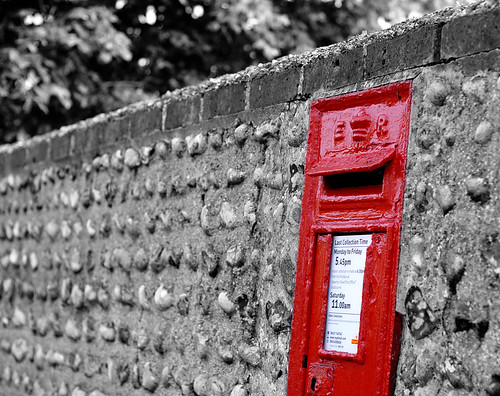
A very simple edit here which I will cover in more detail in a later post. First I adjusted the levels, then made a copy of the shot and converted it to mono. I copied and pasted the mono shot as a new layer on top of the colour one, then added a layer mask. Then I selected the brush tool, and selecting the colour as black I painted over the postbox, essentially erasing the mono layer to reveal the colour underneath. Once this was done I flattened the image and saved.

I had this exact edit in mind when I took this shot. The house itself was very well kept and clean-looking, but that carrier bag outside was a weird juxtaposition, and that it happened to be the colour I needed for my Orange shot was just perfect. I did the same edit process as above for this shot, then in addition added a vignette -- again something I will cover in a later post.
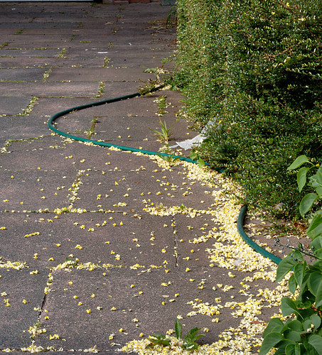
The only edits I did here were the basic levels and sharpening. I could have done more with the composition of this shot I think.
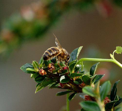
Again just levels and sharpening. This shot didn't occur to me as the "green" until I opened my mind a little -- the subject is the bee but the green is still the dominant colour. Also incidentally, bees are really erratic motherfuckers and I don't know how people are able to successfully shoot them with any regularity.

This little piece of confetti almost didn't get shot at all -- I saw it out of the corner of my eye near the town hall on my way home, and was going to keep walking but made myself stop, change lenses, turn back and shoot. The edit I did here was a weird one -- I used the Filter Pack in GIMP to add a blue filter to the shot without completely recolourising everything. I don't know how it works and it was very experimental from my perspective.
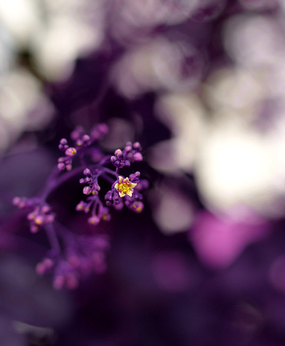
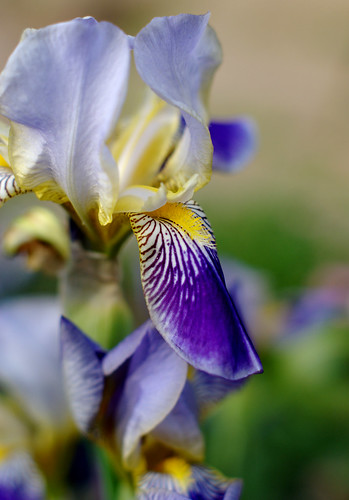
Indigo is a weird colour isn't it? To me, indigo and violet are just fancy-pants way of saying "purple". Anyway, the original of this shot is a very different colour -- the bush itself is a reddish-maroon colour. I went into the Hue-Saturation tool, selected the Red channel and changed the hue until it was a suitable blue-purple colour.
Nothing but levels on this, not even any sharpening. I actually really love this shot.
So there it is -- my first successful mini-project! It's always good to discover new, weird and wonderful processing techniques even if you don't intend to use them too much.

0 comments:
Post a Comment